找到
3
篇与
html
相关的结果
-
-
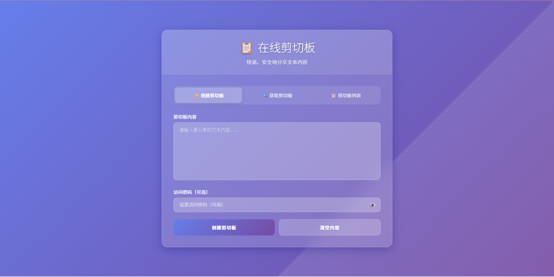
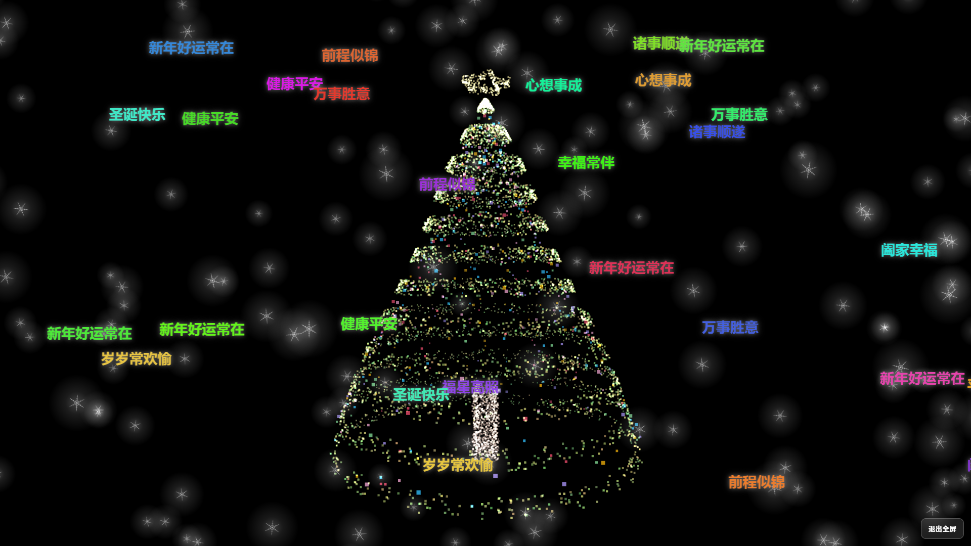
极简在线剪切板源码(html+php) 开发原因 要在多个设备之间复制长文本,但是设备上没有安装微信、QQ等聊天软件,所以很难复制,逐字输入太慢,且如果文本时长链接、脚本命令或代码就容易输入错误,所以需要一个在线剪切板工具。 网上搜索,没有找到想要的,就使用AI开发了一个很简单的在线剪切板。 功能列表 创建剪切板 获取剪切板 剪切板列表 生成剪切板链接 添加查看密码 删除剪切板 使用说明 直接上传到服务器即可使用 剪切板内容存储使用json文件存储 演示站点 演示站点 在线剪切板 演示截图 在线剪切板演示图片图片 代码下载 在线剪切板.zip 下载地址:https://cdn.x7x.fun/uploads/20251001/fc08409ece526fdb.zip 提取码:
-
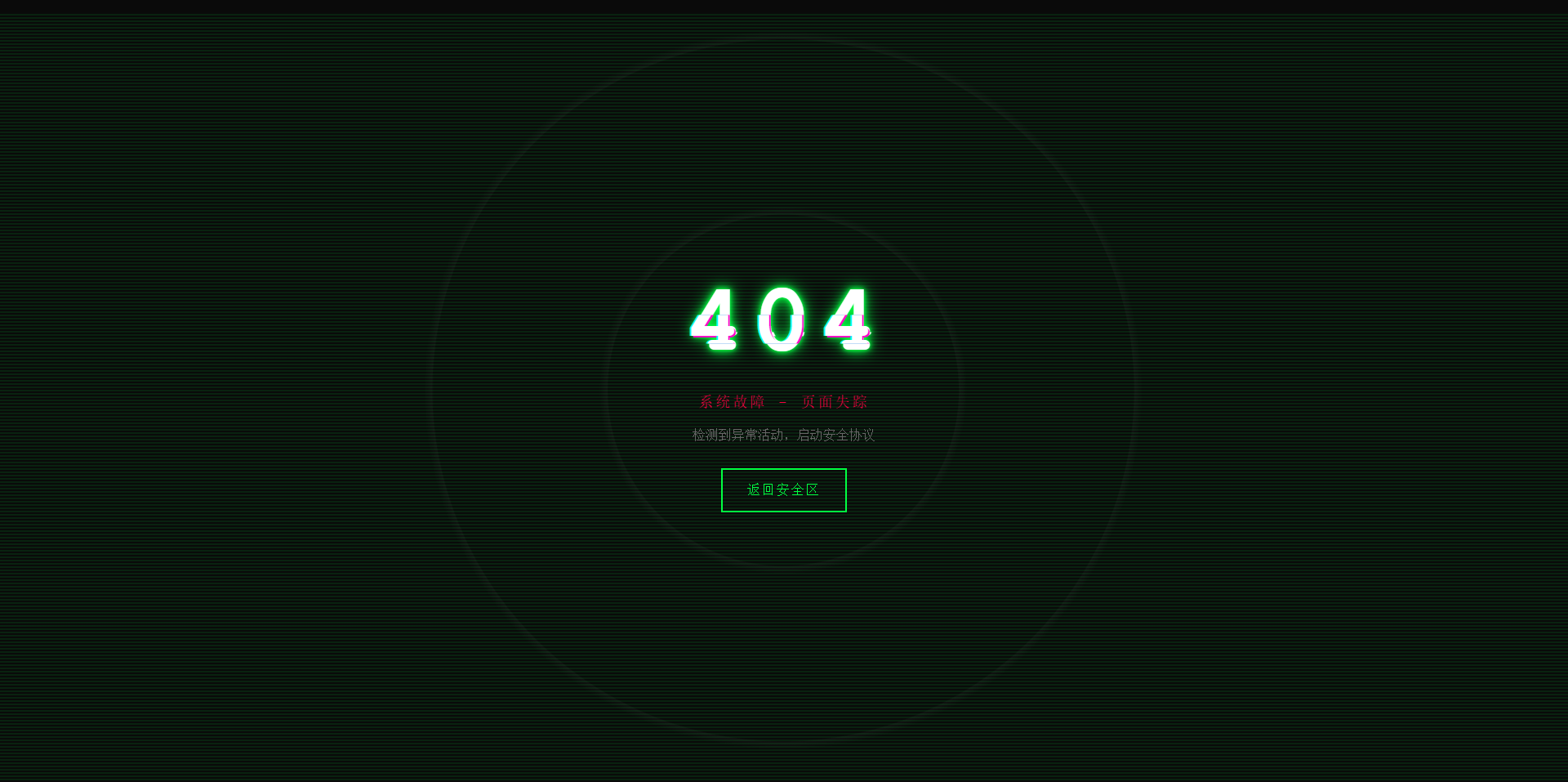
故障风格404页面 效果演示 点击查看在线演示 图片演示图片 完整代码 <!DOCTYPE html> <html lang="zh-CN"> <head> <meta charset="UTF-8"> <meta name="viewport" content="width=device-width, initial-scale=1.0"> <title>系统故障 - 404</title> <style> * { margin: 0; padding: 0; box-sizing: border-box; } body { background: #0a0a0a; font-family: 'Courier New', monospace; height: 100vh; overflow: hidden; display: flex; align-items: center; justify-content: center; color: #00ff41; cursor: crosshair; } .matrix-bg { position: absolute; width: 100%; height: 100%; opacity: 0.1; background: repeating-linear-gradient( 0deg, transparent, transparent 2px, #00ff41 2px, #00ff41 4px ); animation: scan 8s linear infinite; } @keyframes scan { 0% { transform: translateY(-100%); } 100% { transform: translateY(100%); } } .container { text-align: center; position: relative; z-index: 10; } .error-code { font-size: 120px; font-weight: bold; position: relative; display: inline-block; color: #fff; letter-spacing: 10px; animation: flicker 0.5s infinite alternate; } .error-code::before, .error-code::after { content: "404"; position: absolute; top: 0; left: 0; width: 100%; height: 100%; background: transparent; overflow: hidden; } .error-code::before { left: 2px; text-shadow: -2px 0 #ff00c8; animation: glitch-1 0.3s infinite ease-in-out alternate-reverse; clip: rect(44px, 450px, 56px, 0); } .error-code::after { left: -2px; text-shadow: -2px 0 #00ffff, 2px 2px #ff00c8; animation: glitch-2 0.3s infinite ease-in-out alternate-reverse; clip: rect(44px, 450px, 56px, 0); } @keyframes glitch-1 { 0% { clip: rect(31px, 9999px, 94px, 0); } 20% { clip: rect(112px, 9999px, 76px, 0); } 40% { clip: rect(85px, 9999px, 77px, 0); } 60% { clip: rect(62px, 9999px, 34px, 0); } 80% { clip: rect(97px, 9999px, 89px, 0); } 100% { clip: rect(53px, 9999px, 47px, 0); } } @keyframes glitch-2 { 0% { clip: rect(65px, 9999px, 119px, 0); } 20% { clip: rect(52px, 9999px, 74px, 0); } 40% { clip: rect(4px, 9999px, 78px, 0); } 60% { clip: rect(100px, 9999px, 19px, 0); } 80% { clip: rect(22px, 9999px, 98px, 0); } 100% { clip: rect(89px, 9999px, 113px, 0); } } @keyframes flicker { 0%, 19%, 21%, 23%, 25%, 54%, 56%, 100% { text-shadow: 0 0 5px #00ff41, 0 0 10px #00ff41, 0 0 20px #00ff41; } 20%, 22%, 24%, 55% { text-shadow: none; } } .error-message { font-size: 18px; color: #ff0040; margin: 20px 0; animation: pulse 2s infinite; text-transform: uppercase; letter-spacing: 3px; } @keyframes pulse { 0%, 100% { opacity: 1; } 50% { opacity: 0.3; } } .home-button { display: inline-block; padding: 15px 30px; margin-top: 30px; border: 2px solid #00ff41; background: transparent; color: #00ff41; text-decoration: none; text-transform: uppercase; letter-spacing: 2px; position: relative; overflow: hidden; transition: all 0.3s; font-family: 'Courier New', monospace; } .home-button:hover { color: #0a0a0a; box-shadow: 0 0 20px #00ff41; } .home-button::before { content: ''; position: absolute; top: 0; left: -100%; width: 100%; height: 100%; background: #00ff41; transition: left 0.3s; z-index: -1; } .home-button:hover::before { left: 0; } .noise { position: absolute; top: 0; left: 0; width: 100%; height: 100%; background: radial-gradient(circle, transparent 20%, rgba(255,255,255,0.03) 20.1%, transparent 21%), radial-gradient(circle, transparent 40%, rgba(255,255,255,0.03) 40.1%, transparent 41%); animation: noise 0.5s steps(10) infinite; pointer-events: none; } @keyframes noise { 0%, 100% { transform: translate(0); } 10% { transform: translate(-2px, -2px); } 20% { transform: translate(2px, 2px); } 30% { transform: translate(-2px, 2px); } 40% { transform: translate(2px, -2px); } 50% { transform: translate(-2px, -2px); } 60% { transform: translate(2px, 2px); } 70% { transform: translate(-2px, 2px); } 80% { transform: translate(2px, -2px); } 90% { transform: translate(-2px, -2px); } } .system-info { position: absolute; bottom: 20px; left: 20px; font-size: 12px; color: #666; font-family: monospace; animation: typewriter 3s steps(30) 1; } @keyframes typewriter { from { width: 0; } to { width: 100%; } } @media (max-width: 768px) { .error-code { font-size: 80px; } .error-message { font-size: 14px; } } </style> </head> <body> <div class="matrix-bg"></div> <div class="noise"></div> <div class="container"> <h1 class="error-code">404</h1> <p class="error-message">系统故障 - 页面失踪</p> <p style="color: #666; margin-top: 10px;">检测到异常活动,启动安全协议</p> <a href="https://www.khkj6.com" class="home-button">返回安全区</a> </div> <script> // 随机故障效果 setInterval(() => { document.body.style.filter = `hue-rotate(${Math.random() * 360}deg)`; setTimeout(() => { document.body.style.filter = 'none'; }, 100); }, 3000); // 鼠标追踪效果 document.addEventListener('mousemove', (e) => { const x = e.clientX / window.innerWidth; const y = e.clientY / window.innerHeight; const glitch = document.querySelector('.error-code'); glitch.style.transform = `translate(${x * 4}px, ${y * 4}px)`; }); </script> </body> </html>