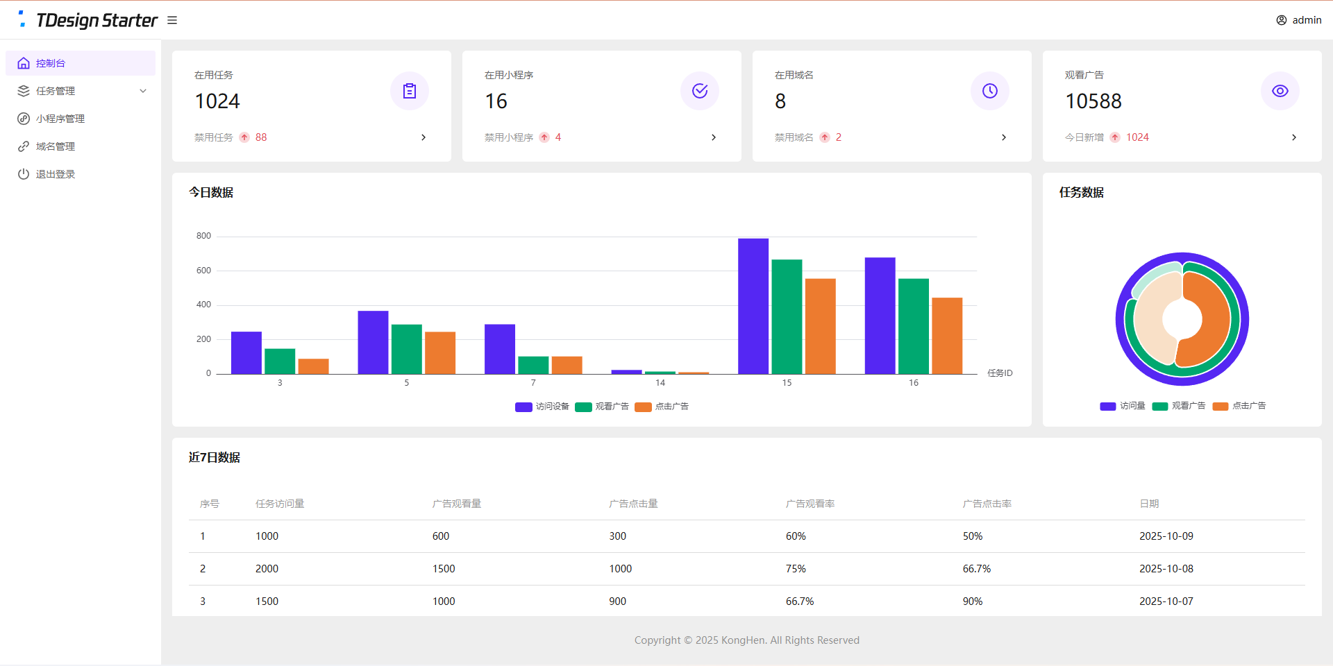
uniapp-x自带导航栏位置固定,且UI无法修改。如果需要适配自己的应用UI及色彩就需要自定义tabbar。
实现说明
将tabbar写入主页面,需要显示的页面作为组件引入。
示例样式

实现方法
使用swiper实现
说明:
- 所有页面一次性加载
- 允许左右滑动
- 优点:允许滑动切换,用户体验升级
演示代码
<template>
    <!-- 页面内容区域 -->
    <swiper style="flex: 1;" :current="selectedIndex" @change="swiperChange">
        <swiper-item item-id="index">
            <IndexPage></IndexPage>
        </swiper-item>
        <swiper-item item-id="more">
            <MorePage></MorePage>
        </swiper-item>
        <swiper-item item-id="user">
            <UserPage></UserPage>
        </swiper-item>
    </swiper>

    <!-- tabber区域 -->
    <view class="tab-bar-container">
        <view v-for="(item, index) in tabList" class="tab-bar-item" @click="switchTab(index)">
            <image class="tab-bar-icon" :src="(selectedIndex === index ? item.s_icon : item.icon)"></image>
            <text class="tab-bar-text"
                :style="'color:' + (selectedIndex === index ? '#F59E0B' : '#999999') +';'">{{ item.name }}</text>
        </view>
    </view>
</template>

<script setup lang="uts">
    // 导入页面
    import IndexPage from "./tabbar/index.uvue"
    import MorePage from "./tabbar/more.uvue"
    import UserPage from "./tabbar/user.uvue"

    // tabbar接口类型
    type TabInfo = {
        name : string,
        icon : string,
        s_icon : string
    }
    // 页面列表
    const tabList = reactive<TabInfo[]>([
        {
            name: "首页",
            icon: "/static/tabbar/home.png",
            s_icon: "/static/tabbar/home_selected.png"
        },
        {
            name: "活动",
            icon: "/static/tabbar/more.png",
            s_icon: "/static/tabbar/more_selected.png"
        },
        {
            name: "我的",
            icon: "/static/tabbar/user.png",
            s_icon: "/static/tabbar/user_selected.png"
        }
    ])
    // 选中的页面
    const selectedIndex = ref<number>(0)

    // swiper切换
    const swiperChange = (e: UniSwiperChangeEvent) => {
        let index = e.detail.current
        if (selectedIndex.value === index) return
        selectedIndex.value = index
    }

    // 页面切换
    const switchTab = (index : number) => {
        if (selectedIndex.value === index) return
        selectedIndex.value = index
    }
</script>

<style lang="scss">
    .tab-bar-container {
        position: fixed;
        bottom: 60rpx;
        width: 80%;
        left: 10%;
        z-index: 999;
        display: flex;
        flex-direction: row;
        justify-content: space-around;
        height: 120rpx;
        border-radius: 60rpx;
        box-shadow: 0 4rpx 20rpx rgba(0, 0, 0, 0.1);
        background: rgba(255, 255, 255, 0.4);
    }

    .tab-bar-item {
        display: flex;
        flex-direction: column;
        align-items: center;
        justify-content: center;
        padding: 15rpx 40rpx;
    }

    .tab-bar-icon {
        width: 44rpx;
        height: 44rpx;
        margin-bottom: 8rpx;
    }

    .tab-bar-text {
        font-size: 24rpx;
    }
</style>
官方示例
说明:
- 单次只加载一个页面
- 加载成功后使用v-show控制显示/隐藏,不重复加载(官方使用CSS属性visibility控制,测试不行)
- 优点:分页加载,减小单次加载压力(如果页面DOM多的话)
演示代码
<template>
    <!-- 页面内容区域 -->
    <view style="flex: 1;">
        <IndexPage v-if="tabList[0].init" v-show="selectedIndex==0"></IndexPage>
        <MorePage v-if="tabList[1].init" v-show="selectedIndex==1"></MorePage>
        <MorePage v-if="tabList[2].init" v-show="selectedIndex==2"></MorePage>
    </view>

    <!-- tabber区域 -->
    <view class="tab-bar-container">
        <view v-for="(item, index) in tabList" class="tab-bar-item" @click="switchTab(index)">
            <image class="tab-bar-icon" :src="(selectedIndex === index ? item.s_icon : item.icon)"></image>
            <text class="tab-bar-text"
                :style="'color:' + (selectedIndex === index ? '#F59E0B' : '#999999') +';'">{{ item.name }}</text>
        </view>
    </view>
</template>

<script setup lang="uts">
    // 导入页面
    import IndexPage from "./tabbar/index.uvue"
    import MorePage from "./tabbar/more.uvue"
    import UserPage from "./tabbar/user.uvue"

    // tabbar接口类型
    type TabInfo = {
        init: boolean,
        name : string,
        icon : string,
        s_icon : string
    }
    // 页面列表
    const tabList = reactive<TabInfo[]>([
        {
            init: true,
            name: "首页",
            icon: "/static/tabbar/home.png",
            s_icon: "/static/tabbar/home_selected.png"
        },
        {
            init: false,
            name: "更多",
            icon: "/static/tabbar/more.png",
            s_icon: "/static/tabbar/more_selected.png"
        },
        {
            init: false,
            name: "我的",
            icon: "/static/tabbar/user.png",
            s_icon: "/static/tabbar/user_selected.png"
        }
    ])

    // 选中的页面
    const selectedIndex = ref<number>(0)

    // 页面切换
    const switchTab = (index : number) => {
        if (selectedIndex.value === index) return
        if (!tabList[index].init) {
            tabList[index].init = true
        }
        selectedIndex.value = index
    }

</script>

<style lang="scss">
    .tab-bar-container {
        position: fixed;
        bottom: 60rpx;
        width: 80%;
        left: 10%;
        z-index: 999;
        display: flex;
        flex-direction: row;
        justify-content: space-around;
        height: 120rpx;
        border-radius: 60rpx;
        box-shadow: 0 4rpx 20rpx rgba(0, 0, 0, 0.1);
        background: rgba(255, 255, 255, 0.4);
    }

    .tab-bar-item {
        display: flex;
        flex-direction: column;
        align-items: center;
        justify-content: center;
        padding: 15rpx 40rpx;
    }

    .tab-bar-icon {
        width: 44rpx;
        height: 44rpx;
        margin-bottom: 8rpx;
    }

    .tab-bar-text {
        font-size: 24rpx;
    }
</style>
其他方法
使用share-element组件实现
- 复制官方代码,偶先切换页面组件闪动问题。官方
uniapp-xapp的demo测试正常,不知道申明原因。 - 使用
components组件+share-element组件实现的tabbar组件实现,tabbar组件会出现与页面移入方向反向滑动的动画
share-element文档